
Choosing the fonts for a particular project can be a difficult process for many people. There are a few general rules that many designers and layout artists follow to make the process a little easier.
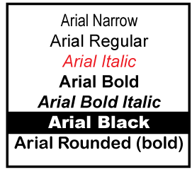
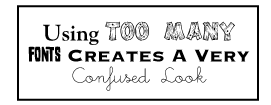
One can always use another font… for what? is the question. It's very easy to use too many fonts in a document. In fact, overdoing the number of fonts is one of the most common mistakes in page and document design. The use of more than three separate fonts on a page can create visual confusion that detracts substantially from your message. It is usually better to use just one or two fonts and make judicious use of the variations of "bold", "italic", point size, color or perhaps a special effect.
The web is an incredible resource for fonts: free, shareware and commercial. Adobe is certainly one of the most respected names when it comes to fonts of a commercial nature. Now, you might ask yourself, "Why would I pay $40 for a single font, when I can jump on the web and download hundreds for free?" Well, you generally get what you pay for; this is just as true about fonts as anything else. Here is what you can expect from each and every Adobe font:
All of the above are not likely to be the case with most free, or even shareware, fonts. The lack of these features can cause more problems than can be compensated for by the "savings" of $40, $80 or even several hundred dollars on any particular project. You can review much more about Adobe's fonts at their web site.
Many of us find the phrase "free fonts" to be a siren's call to pursue the web in search of a font or fifty that we just can't live without.
Herewith, a cautionary note: Garland Printing's Layout Service Can Help With This... Many fonts come in a zip file that includes some form of a "Read Me.txt" file. Be sure and read it. This will tell you if the font is actually free for every kind of use. Some fonts are restricted to non-commercial use. Others are "Trialware" or "Shareware" and have some restrictions on their use until a fee is paid.
If you should use a font that has a restriction that you didn't comply with, you could become liable for damages. Don't take this lightly. There are many people who recognize vast numbers of fonts from memory. Also, you put your printing company in a very difficult spot if someone recognizes the font and asks the company for proof of registration. There are 1000's of truly free fonts; use them or comply with the agreement that accompanies the font file. We'll all sleep better.
When using a font that you've found, be aware that it may have some problems when it is used in various graphic and layout programs. It may not embed properly or respond properly to formatting commands. To use the font may mean you will have to make some allowances or compromises in these areas.
Difficulties with your layout? Garland Printing to the rescue!The font may look just great on your monitor at 50 points, but when it gets on the page at 24 points, it may not do so well. Of course the problem can be seen at a smaller size and blowing it up several points, whereupon it begins to fall apart. This is not the fault of your print shop; the font just has a limited range.
Often, free fonts come with very limited character sets. Make sure that all the characters that you will need for your project are included (do you need bold, italic, numbers or punctuation?), and that they all print correctly at their final sizes. Garland Printing...the right choice Be sure and embed the fonts in your document. Often, a Portable Document Format (PDF) file will give you excellent results and help eliminate problems with layouts and fonts. This file format can be created in Adobe Acrobat. The Acrobat Reader program cannot generate or edit these files, only read them.